Forensic Typography — Exhibition Design
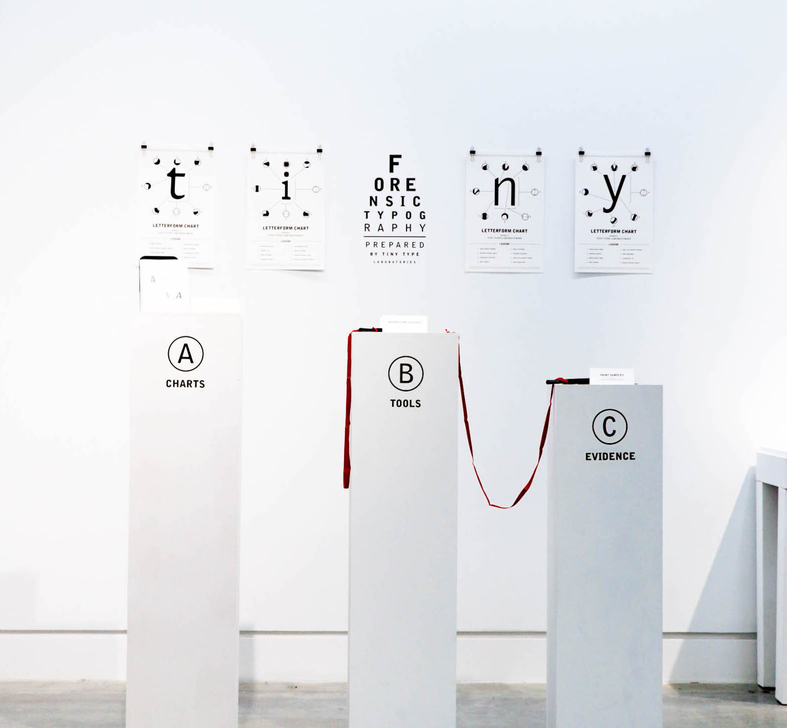
What makes or doesn't make a legible letterform? “Forensic Typography by Tiny Type Laboratories” is an examination of the details that are important in tiny typesetting such as form, width, height, and stroke. An up close and personal look at the qualities of effective (and ineffective) tiny typography.
This project was exhibited during Emily Carr University of Art + Design’s 4th Annual Pop Up Type Museum, presented in partnership with Type Brigade.
Photographs taken by Rydel Cerezo.

FORENSIC TYPOGRAPHY 2018
Exhibition Design
Creative Direction
Print
Exhibition Design
Creative Direction
INFO
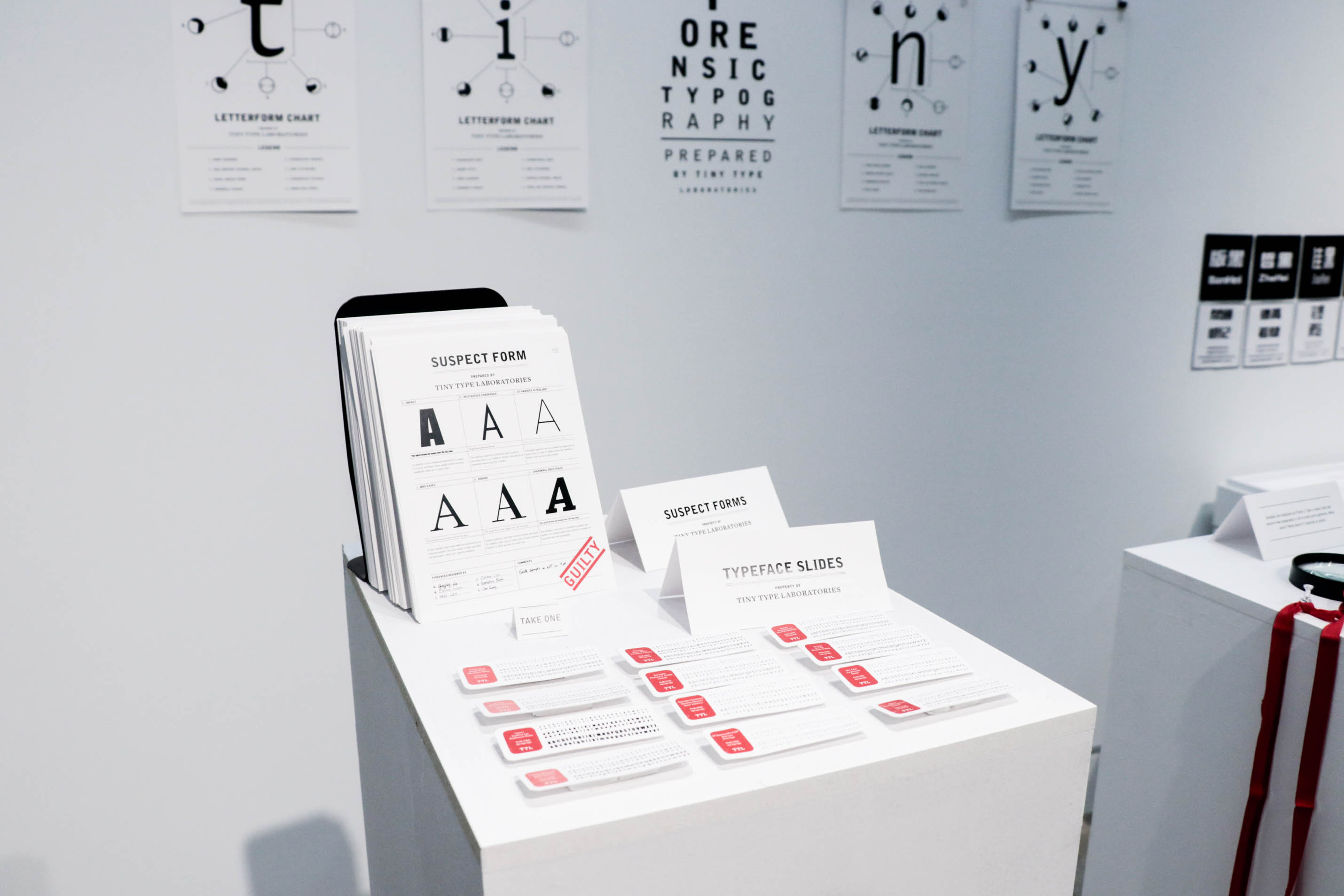
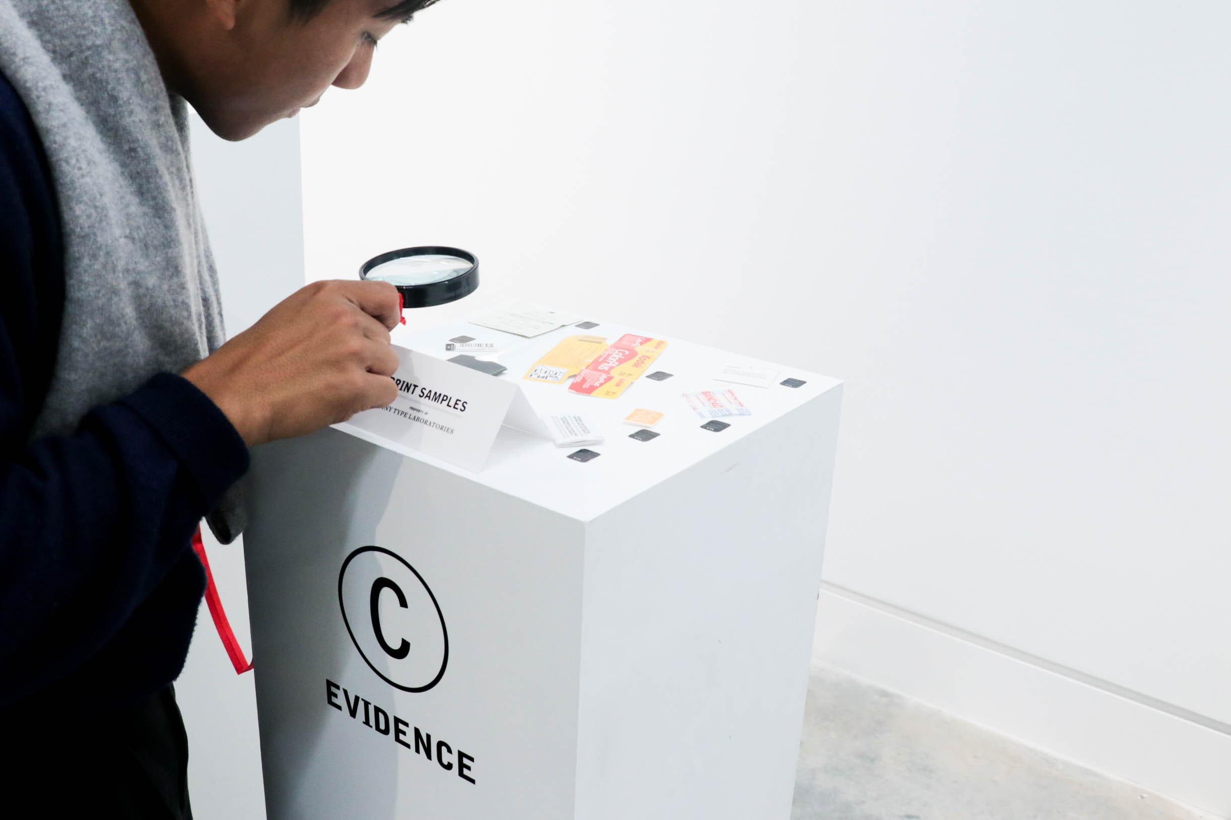
A fictional forensic laboratory presents the audience with evidence of effective and ineffective tiny typesetting. Letterform Charts on the wall inform the qualities of letterforms that contribute to legibility. Suspect Forms and Typeface Slides outline why certain fonts work and others don’t when set in sizes 8pt and below. Evidence of real-life print samples are available for the audience to examine afterwards.
A fictional forensic laboratory presents the audience with evidence of effective and ineffective tiny typesetting. Letterform Charts on the wall inform the qualities of letterforms that contribute to legibility. Suspect Forms and Typeface Slides outline why certain fonts work and others don’t when set in sizes 8pt and below. Evidence of real-life print samples are available for the audience to examine afterwards.


Una Gil
ⓒ Una Gil 2025. All rights reserved.
