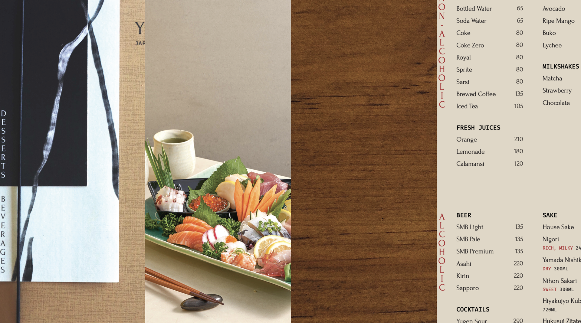
Yugen — Brand Identity & Publication Design
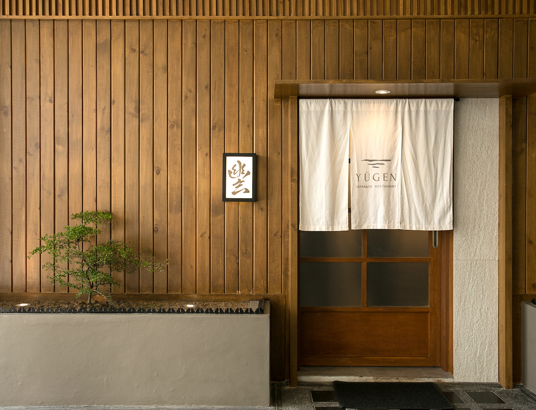
Brand identity and brand guidelines, publication design, creative direction, and a typographical system were designed for Yūgen, an intimate and elegant Japanese restaurant in Pasig, Philippines.
Header photograph by Patrick Mateo © F&B Report PH. Food photography © Yūgen Japanese Restaurant PH.
YUGEN — 2023
Logo Design
Brand Identity
Creative Direction
Publication Design
Illustration
Logo Design
Brand Identity
Creative Direction
Publication Design
Illustration
INFO
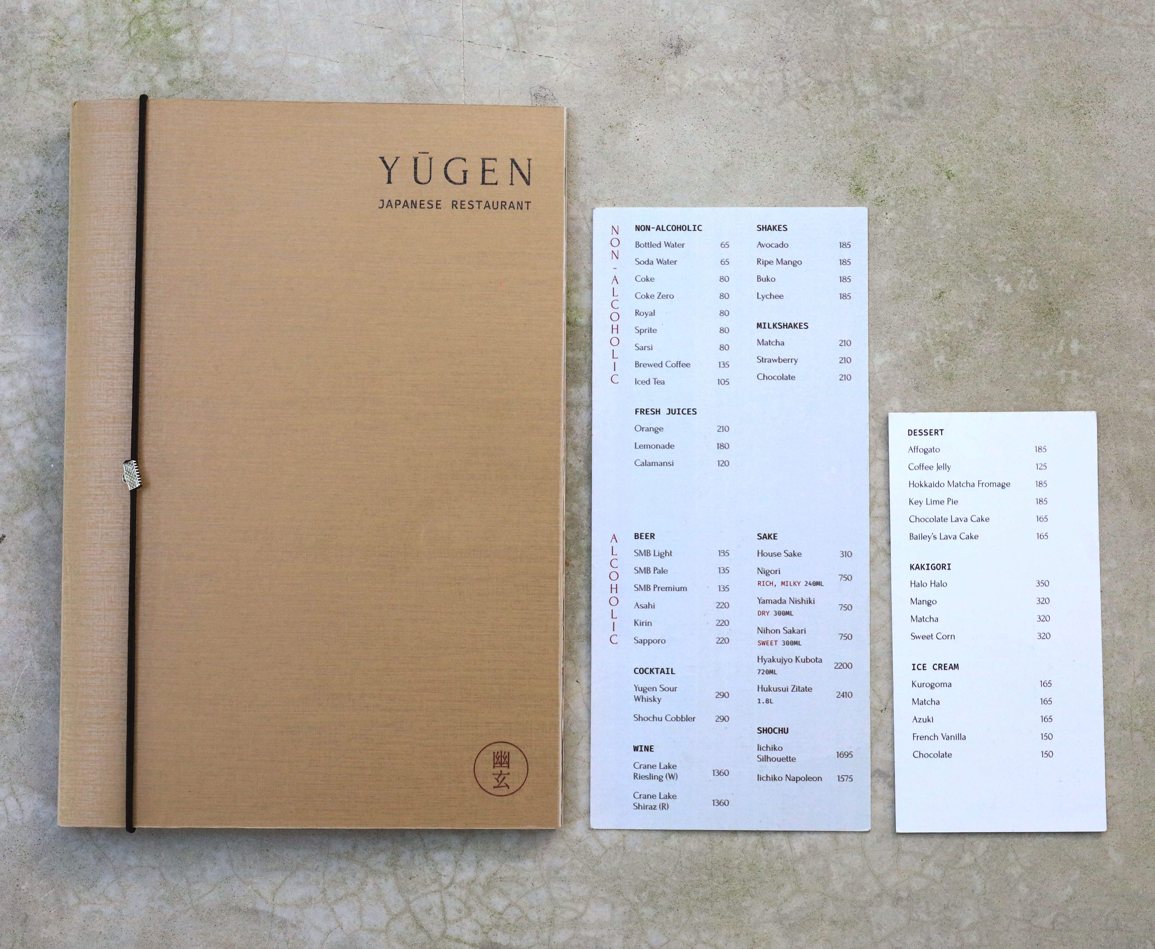
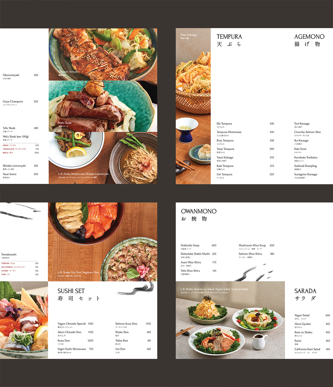
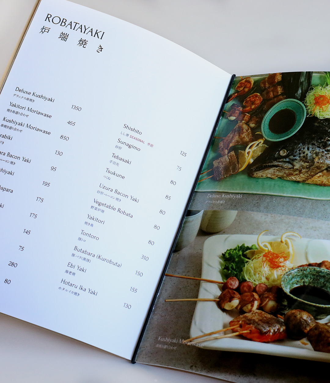
I was tasked to create a brand identity from the ground up for Yūgen Japanese Restaurant that would encompass the concept of yūgen itself - subtle and suggestive beauty. This scope included creating a logo and variations for various situations and touchpoints, a colour scheme, a typographical system, menu designs, illustrative assets, and a variety of smaller print collateral (paper napkins, chopstick wrappers, takeout bags, stickers) which I owned from conceptualization to delivering the print-ready files to the client. I also assisted with the decision-making of the creative direction of the menu’s food photography.
I wanted to create a brand that felt cohesive in a subtle way - from the illustrative accents and elements, to the layering of the menus, to the elegant and flexible typographical system, to ensure that the print collateral I designed would complement the restaurant’s beautiful interiors and add to the experience of dining guests. I also packaged all the individual illustrations, assets, brand guidelines, logo variations, font files, templates, and print-ready files. These were delivered to the client to ensure that they would be able to unify their brand’s look even without my assistance.
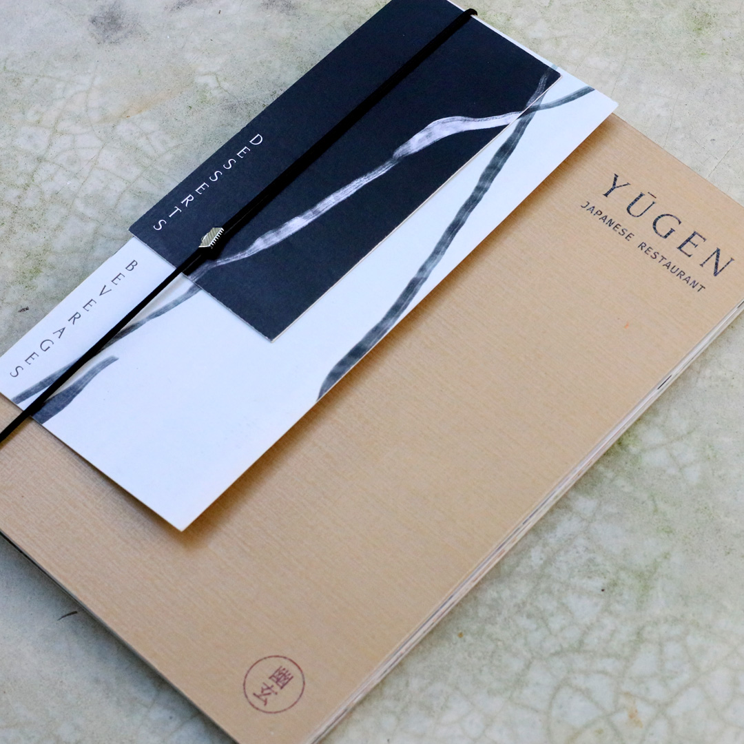

The shape of the logo represents the subtle negative space of the letter “Y” in Yugen, depicted by brush strokes that are reminiscent of forms we see in nature. They can be calm ocean waves, clouds on a skyline, or sand and rocks nestled in a zen garden.
The brand design, colour scheme, typography, photography, and visuals were created with this concept of yugen in mind.


